
Information by color
Impact: High to major
Users mainly impacted: Blind, visually impaired
RGAA criteria: Criterion 3.1 [A] - Criterion 3.2 [A]
Explanation
An information provided by the color impacts many users. For blind people who can not see colors, or distinguish certain colors or color combinations, information provided only by color will be ignored.
The most common case of information by color is the indication of the active page in a navigation menu. In this case, a simple repair consists in providing the information using a text, so that a user who does not perceive the colors (blind or user not perceiving the contrasts) can access the same information. In the case of the active link, we can simply add a reference in the link’s title: “Home - current page”.
The principle to keep in mind is that any color that conveys information must be accessible by other way, including a textual element.
Examples
In a form
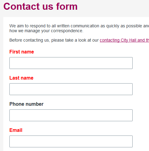
In this form above, the fields with a red label are required. If you cannot see this color, it is not possible for you to fill in this form correctly. In this case, prefer to add the mention ‘required’ directly in the label.
In a menu
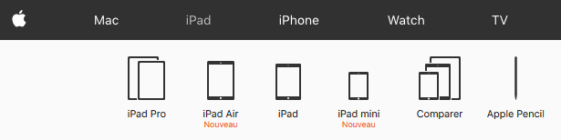
In this menu, the page where we are (iPad) is illustrated by a different color from the other pages. Similarly, if you cannot see this color, you lose this information in the menu.
Information must not be conveyed through color only
Be sure the information given by another way than color is consistent. It is important to provide the information by a color, a shape and a text.
The ways of transmitting information other than by colour can be:
- a textual indication,
- involving graphics (pictogram, background image, shape, different border style, etc.) and through a code complement (aria-label, title, hidden text, aria-current, etc.),
- another typographic style (bold, italic, text size, other font, etc.) and through a code complement (aria-label, title, hidden text, aria-current, etc.).
When using aria-current, make sure that the information is not given by color and aria-current only. Visually impaired people who cannot perceive color may not necessarily use a assistive technology capable of interpreting aria-current. In this case it is necessary to add shape, size or position to the element.
Examples
In a form
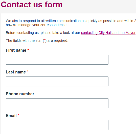
In this example, the required fields are marked with a textual indication (red star). In this case, red star is not relevant because this does not imply the requirement to fill in the field. It is necessary to add a mention about the required fields like in the example before the form.
The best way to be most relevant is to write the required statement directly inside the label. Example: First name (required). This information is purely visual because the field have already a required or aria-required attribute. In order to avoid redundancy of information, it is therefore preferable not to read the required information in the label. Add the attribute aria-hidden to true on this text.
<label for="name">Name <span class="required" aria-hidden="true">(required)</span></label>
<input type="text" id="name" name="name" required>
Using the require attribute on the field is not enough. People who do not use technical assistance do not have the information.
In a Apple menu
Currently Apple menu
Fixed Apple menu
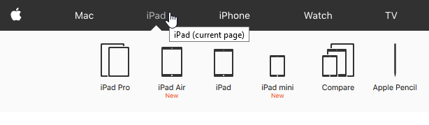
In this menu, we have added a shape (the triangle under the active item) and a code complement (link title attribute).
In this example, to replace the title attribute, it also possible to use the aria-current attribute to provide the state of the element through the code.